The products featured in this post were given to me by Island Batik, Hobbs, and Aurifil.
This month's Island Batik challenge is Make It Modern with Hobbs. Last month for the AccuQuilt challenge I used my cool color scraps with a neutral background. This month, I decided to use my warm colored scraps, and initially intended to use a tan neutral background. I toyed with the idea of using the same layout and the AccuQuilt again, but eventually decided that I would piece a scrappy slab. I didn’t have a final layout in mind and just started sewing.


When I finished piecing almost all of my scraps I had a slab that measured approximately 32“ x 42“. Since I was shooting for a 40“ x 40“ quilt I had plenty to work with. Along the way I decided to swap out my tan neutral background, in favor of a solid black batik instead. I really love how the variety of warm colors pop against the black. I had realized that the light tones of the yellows were going to blend into the tan background more than I wanted them to.

My quilt back is color blocked, pieced from remnants of the Petting Zoo fabric collection that I used in a previous project, with a little more solid black.

And for my quilt top I opted for a simple overall layout with two wide vertical strips of my scrappy slab, and filled in the background with solid black.

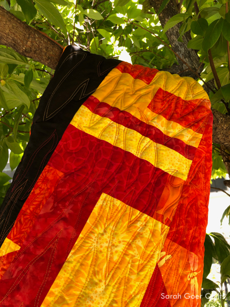
The fiery palette was just asking for flame quilting. I chose three colors of Aurifil 50wt: Red (#2250), Burnt Orange (#1133), and Yellow (#2135). I searched for "line art of fire" on Google to get an idea for the shapes. Then I went for it. I started with the lowest row of red quilting, traveling in an uphill and then downhill direction across the quilt, then I echoed that line in the same color thread. I repeated paired lines of stitching across the quilt in each color. Last time I used Hobbs Tuscany 100% Wool I liked the puffy result of the higher loft, but felt that I hadn’t done the batting justice since my quilting had the same density across the whole project. This time I really wanted to have flatter areas and puffier areas. I switched gears from what was originally in my mind, but by doing a double row of stitching for each pass I created more texture than I would have had with single lines of stitching.

The back of the quilt really shows the texture so well.


Once the top was quilted and trimmed I started to think about binding. The easy option would have been a solid black binding for the whole quilt, but I couldn’t resist adding in some pieced binding and matching up with the piecing on the quilt top. I had a strip big enough from when I trimmed the quilt to be one edge of the binding though I had to adjust the width of each section since the quilt top had shrunk up a bit from the quilting. I had extra scrappy slab that I cut pieces from for the bottom edge of the binding. Lining everything up on the first pass of attaching the binding was a little tricky. I used pins at the seams so the binding would match up and worked backwards to the corners. I also opted to work with two pieces of binding that I would join on each of the two black sides. Finally, I had to decide what color to topstitch my machine binding. I really considered stitching black on black and orange on the scrappy sections, but decided in the end to use orange for the whole binding. This meant that the stitching would show up strongly on the black binding, but since I match my bobbin thread color to my top thread the orange thread on the bottom of the quilt would blend in more with the yellow orange and red I had used for quilting (and because most of the backing fabric is not black). Black stitching along the edge would have been more distracting on the quilt back. I used my basic machine binding technique.

I've been kind of lazy about quilt labels lately, but used my preferred method of making a label and attaching the label to the quilt back prior to quilting. I use a micron pen to do my writing. I realize now I forgot the name of the quilt: On Fire. I'll have to add that. ;-)


On Fire finishes at approximately 41" x 41".

Thanks for visiting! Be sure to check out the Make it Modern projects from the other Island Batik Ambassadors.
I'm linking up to TGIFF, Needle and Thread Thursday, Put Your Foot Down, Beauties Pageant, and Favorite Finish.