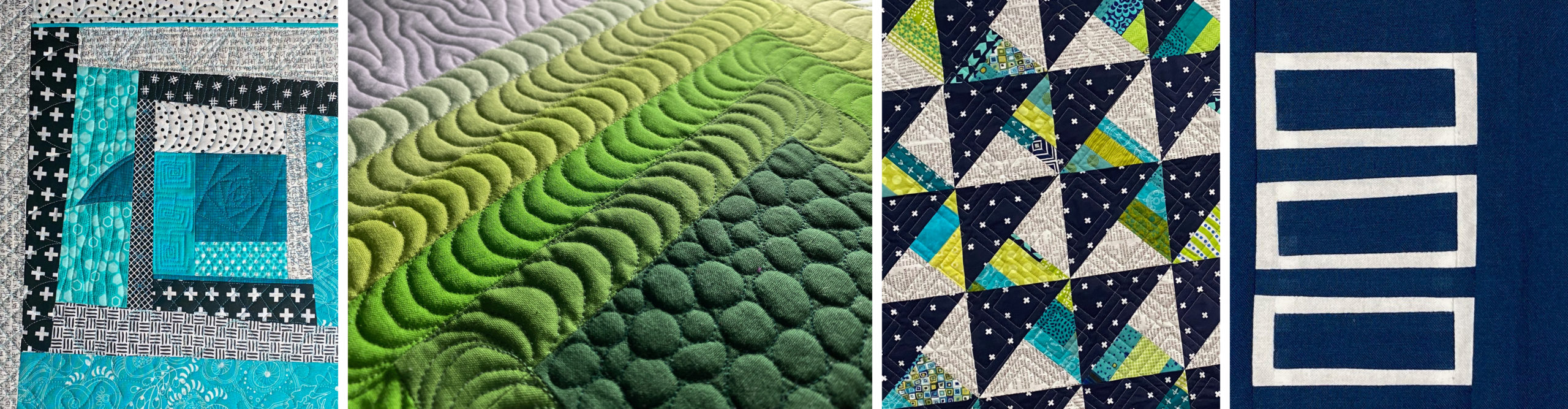
Yesterday I shared my Top Nine from Instagram. Another fun IG activity this time of year is Year of Colour. It's a web app for creating a graphic representation of the colors using throughout all IG posts in 2018. You can also get a report of the last month, last year, or custom period of your choice.
Once the initial report is generated, you can change the settings on the data to emphasize saturated colors, emphasize brighter colors, reload with a color of your choice in the center, order colors by time, rainbow mode, or play through which is a slide show mode. There are also two sliders in the settings which filter by significance and vibrancy of the colors. The report is described on the website as: "Each circle represents one of ten significant colours we've extracted from each image they posted in a year. The size of the circles indicates two things - how significant the colour was in the image, and how well liked it was by their followers."
Bottom line, this app is a color-lover's dream! I used many Year of Colour graphics from others as inspiration for color palettes in my newsletter. (Not a subscriber? Signup here.)
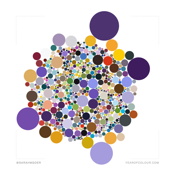
And now for the color! I set my sliders to about 80% on significance (the farther to the right on the first slider, the more circles show) and to most saturated color (left end of the slider) for vibrancy. Captions on each of the following five images show what mode created the image.
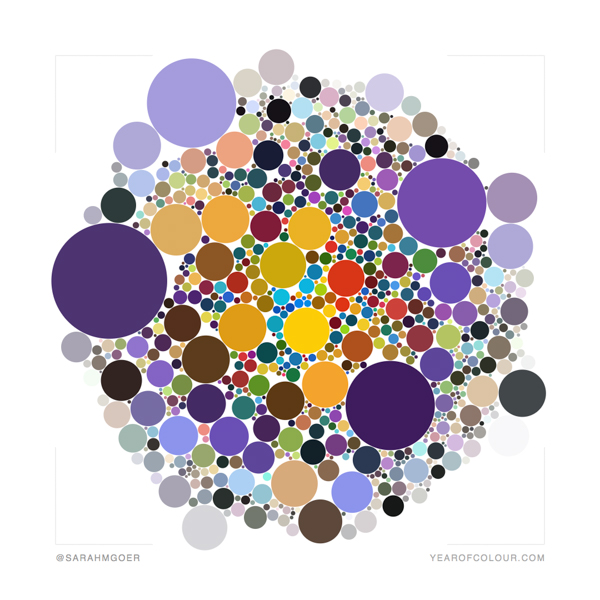
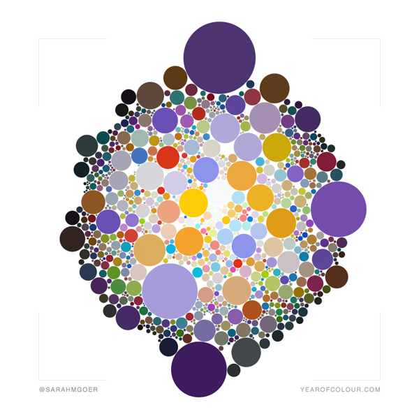
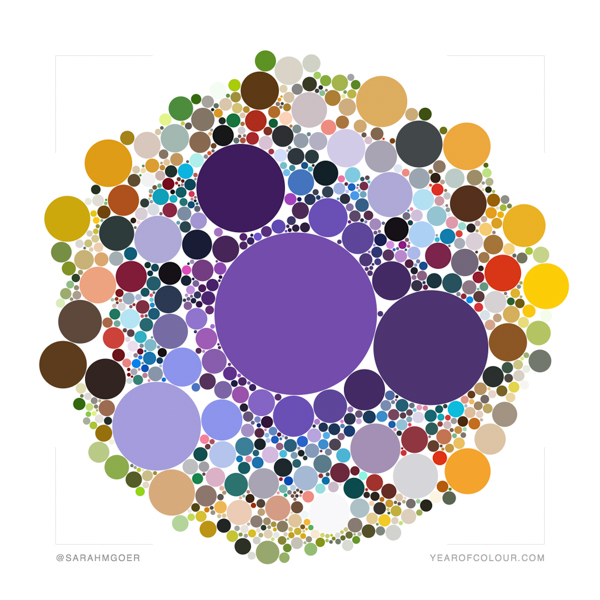
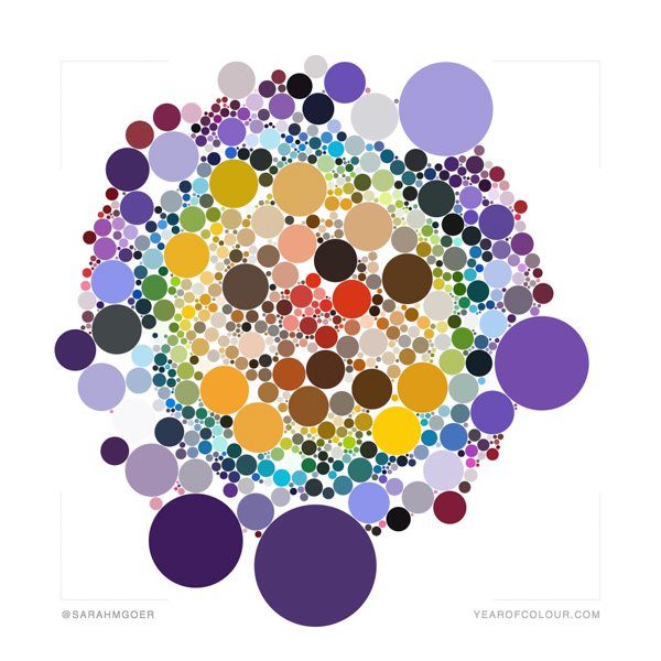
I particularly love the emphasize brighter colors and rainbow modes.
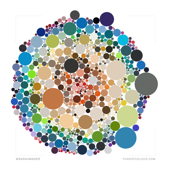
To compare 2018 above to 2017, the following image is the rainbow version of 2017. My favorite color was missing in my work last year!
You can view others' Year of Colour graphics at #yearofcolour and #yearofcolour2018.


Kathleen McCormick
This is such a fun app! Of course, I love the one that show all your purples so vividly.
sarah
Post authorThank you, Kathleen!
Yvonne from Quilting Jetgirl
It is really fun to play with the different setting that Year of Colour offers. It's nice to have a few years of posting to compare against to see how things change.
sarah
Post authorPulling my graphic from last year made me want to generate a report for previous years as well. I think my photography style has changed some which has affected my palette. I think my new floors may feature as photo backgrounds and change the palette in the coming year. Thanks for visiting, Yvonne.
Anja @ Anja Quilts
Lots of purple!! I'll have to remember to head over and see what mine looks like.
sarah
Post authorBe sure to tag me if you share it on IG so I don't miss it! :-)