It's about time that I start sharing about what I made at QuiltCon. I'm no longer exhausted just thinking about the whirlwind that was my first QuiltCon experience. I'm working on some other deadline sewing and just itching to get back to playing with my newest projects that were started at QuiltCon.
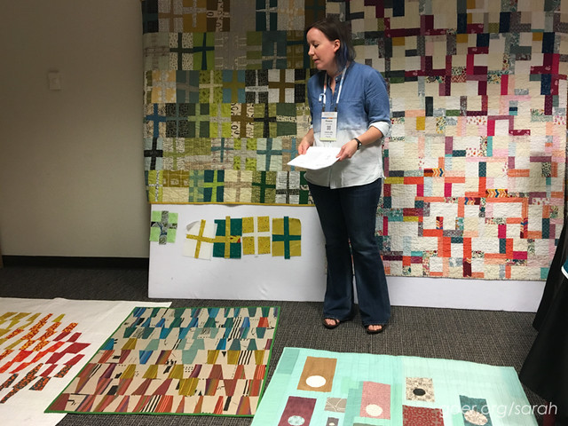
I dove in with a 6-hour class on Thursday, Intermediate Improv: Crosses, Cabins and Colors with Rossie Hutchinson. I had the pleasure of being in class with a couple of my guildmates, which was great since I only joined the Silicon Valley Modern Quilt Guild chapter in October and I'm still getting to know people. Rossie was delightful. She packed in a great amount of content with the perfect balance of instruction time and sewing time. In the first three hours of the class she taught her techniques for improv crosses, liberated log cabins and quartered log cabins, giving us time to complete at least one of each of these blocks. The afternoon included additional sewing time and instruction on color palettes and composition within a project, as well as details about combining odd-sized and irregular blocks to put it all together. Everything Rossie had to say was invaluable. She was also a lovely person and an entertaining speaker. I would take any class she taught in the future!
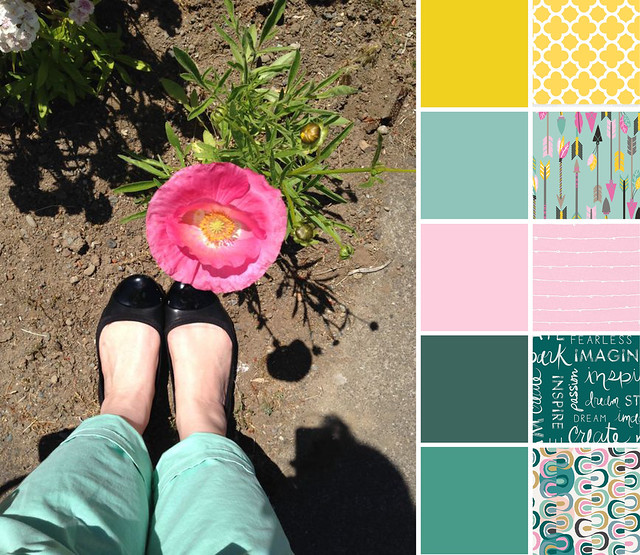
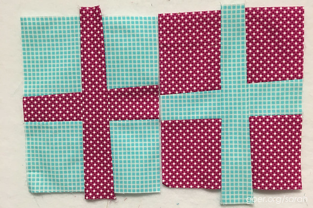
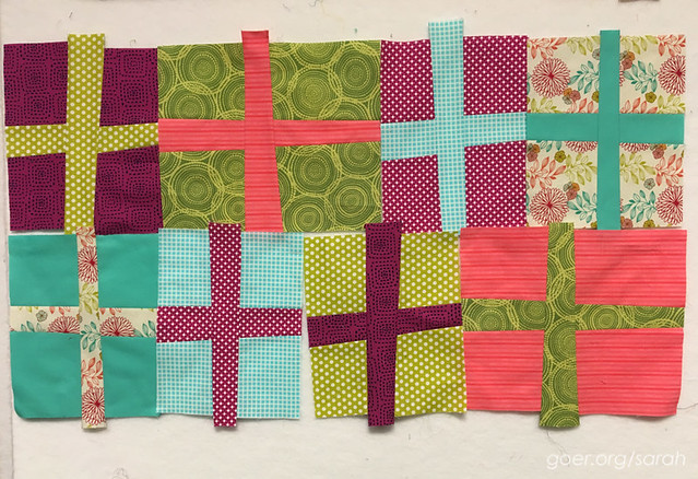
We started with the crosses. They go together quickly and only require choosing two fabrics at a time (that contrast in color or value) as the blocks are constructed in pairs. I opted for 11" tall blocks, which will be pieced into rows in the final project. This was the project that I spent most of my extra sewing time working on. It was rewarding to see the pile of blocks add up so quickly. My fabric pull for this block was centered around the multi-color floral print you see in the second photo below. The majority of my stash is blenders, so I started with the floral to set my palette and chose my other fabrics from there, looking for a range of values and multiple fabrics in each of the colors.
The second block we worked on felt most challenging to me. A liberated log cabin has so many options. I consider the block I made incomplete, both because I don't like the pink as the final border and because I'd want to work with larger sized blocks, but this isn't a project I intend to pursue right now. I loved Rossie's sample for this block, but I think I'd do better with this type of project at home where I could spread out in my sewing room and work on multiple blocks at once. I think the benefit of working on multiple blocks at once would be seeing what patterns emerge. I didn't really have a plan as I worked on this block. You see I chose to work with a different palette (since I couldn't decide on just one for the class, I brought two), chosen around the Cotton & Steel Viewfinders fabric, and already in my incomplete block I've used 6 different fabrics. The other benefit of working on multiple blocks at once would be using the extra bits from one block in the construction of the other block, which I think would allow for some cohesion from the beginning. I didn't dislike this block technique. I just liked the other two better. I think this block is destined for my orphan block box for the time being. :-)

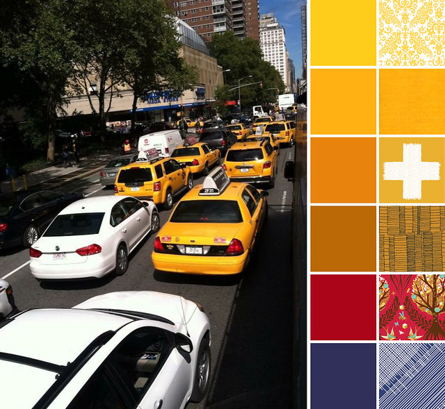
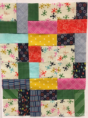
Our third block for class was the quartered log cabin. After the unlimited options of the liberated log cabin block, I liked moving on to this one since it required using only five fabrics per block. The construction was also relatively simple and fast. (Read Rossie's post with her tutorial on the Quartered Log Cabins.) I opted to use the same Cotton & Steel Jacks fabric for all my center squares. I made three blocks, that were then cut in quarters to make these twelve units, so I would have enough pieces to play with composition a bit. I'll definitely continue to work on this one. Here's what I've got so far from class.
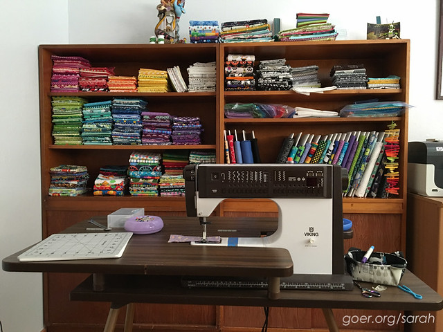
One of my favorite take aways from this class was Rossie's perspective of "what can you add to it to fix it?" with regard to color. There was also an informal discussion in class about what we stash and cutting loose fabrics we don't love. I added, "you'll never use a fabric you don't love to try to fix something that you're trying to love." As I mentioned above, I mostly stash blenders. That's simply because that's what I'm drawn to in the shop and they are so easy for me to use. I've worked on my stash over the last year and there are two big things that have helped me. My first tip is: Have it all visible. (You can see most of mine in this post.) You can't use what you don't know you have. Also, it's easy to see what your gaps are. My second tip is: Purge what you don't love anymore. You may have loved it before, but if you don't now, get rid of it. I have used some up making quick gifts. I've given some to friends. I've donated some. You could also sell it or trade with friends.
Interested in more about how Rossie designs with color? Here's her blog post about her participation as this month's Mighty Lucky Quilting Club instructor.
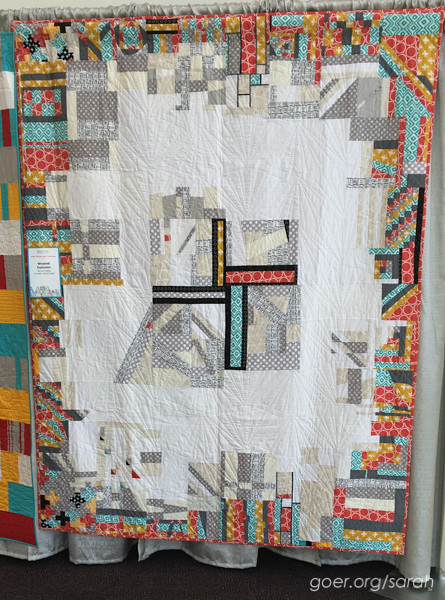
I wanted to take an opportunity in each of my class posts to share some of the quilts I enjoyed at QuiltCon. This first one is Windmill Explosion and is the Silicon Valley Modern Quilt Guild charity quilt that I contributed to. It was so much fun to see the amazing variety of quilts on display for the charity quilt challenge. I didn't take nearly enough pictures of all of them.
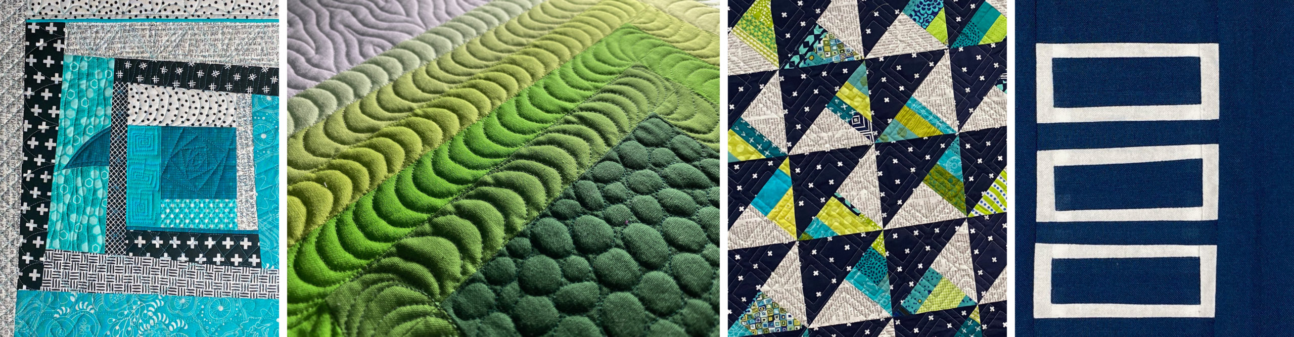
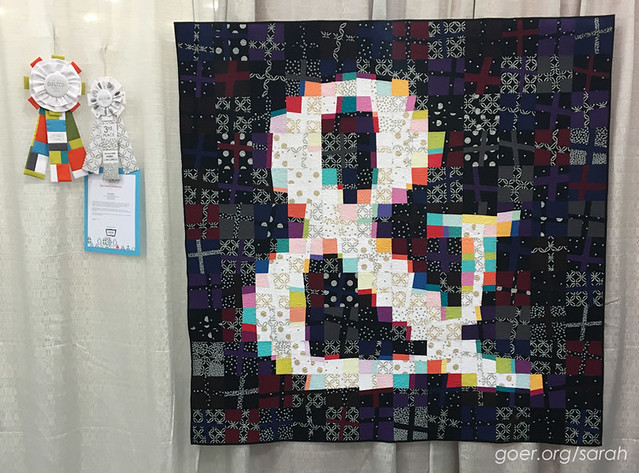
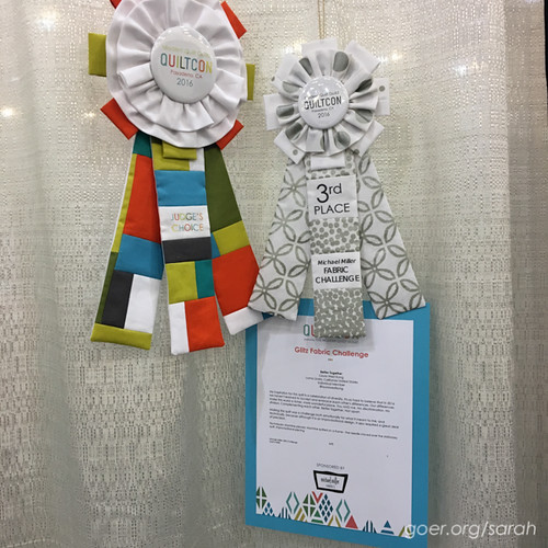
This next one was in the show in the Michael Miller Glitz Fabric Challenge division. The quilt is called Better Together and was made by Laura West Kong. It won two beautiful ribbons, 3rd place in the division and Judge's Choice. I have been drawn to ampersands lately, as my 5-year-old son is really excited about them. I love the composition in this quilt with the use of dark and light, and the bright colors in the ampersand. The combination of improv technique with careful planning is amazing. I loved Laura's message as well. The artist statement reads:
My inspiration for this quilt is a celebration of diversity. It's so hard to believe that in 2016 we haven't learned to accept and embrace each other's differences. Our differences make this world a richer, more wonderful place. You AND me. No discrimination. No division. Complementing each other. Better together. Not apart.
Making this quilt was a challenge both emotionally for what it meant to me, and technically, because although it's an improvisational design, it also required a great deal of precision.
And because those ribbons are such amazing works of art themselves, a closeup of them.
Giveaway *closed*
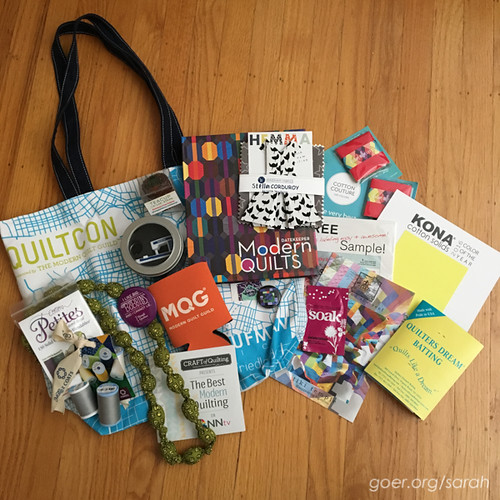
I'm sharing some of my goodies from QuiltCon with one of you. I'll draw one winner on March 24th at 1pm PST out of all entries on my five posts about my QuiltCon classes. (This is the first of the five posts.) The drawing is open to everyone. To enter, please comment below and tell me if you've tried improv and what your favorite improv block/style is. Followers can get a second entry by posting a second comment to tell me how you follow me (Bloglovin', Instagram, etc.). Thank you! Thank you to everyone who entered. The winner is Anja of Anja Quilts!