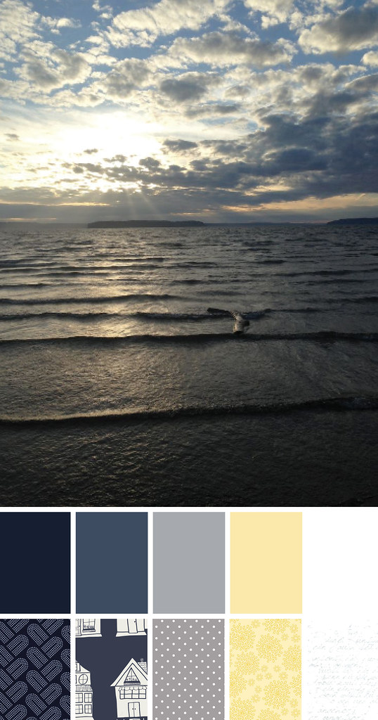
I'm happy to be joining Lorinda and Trina for their Color Play Friday this week! This week's photo, Jetty Sunset, was taken by Lorinda. My job was to create a palette using colors from the photo and create a bundle of 5-8 fabrics inspired by my palette. You can find the full rules on their blogs (links below). None of us saw each other's selections in advance of our posts. I look forward to seeing the different interpretations from this beautiful photo.
I used Palette Builder 2.1 by Play Crafts to select my colors and determine the coordinating Kona solids. Then I surfed around some of my favorite fabric sites to find the coordinating prints.

Solids:
Kona Nautical
Kona Windsor
Kona Titanium
Kona Maize
Kona White
Prints:
Braidy in Navy by Rashida Coleman-Hale, Cotton + Steel
Block Party by Sew Caroline, Art Gallery
Swiss Dots in Gray by Riley Blake Designs
Lulabelle Petal in Yellow by Dodi Lee Poulsen, Riley Blake Designs
Handwriting in Silver White by Zen Chic, Moda
Check out the other palettes this week at:
- Laurel, Poppy & Pine - Lorinda
- In an Otter Life - Trina
- Quilting Mayhem - Mindy
- Quilty Dream - Yvonne
If you'd like to participate in Color Play Friday you can visit In An Otter Life or Laurel, Poppy and Pine for the rules, their contact information, and next week's photo.


Lisa
This is so interesting Sarah. I've often wondered how people got the photos with the fabric swatches and now I know ..sort of. I think I'll have to find some time to play around with these tools.
sarah
Post authorLorinda did a two part Periscope tutorial for Color Play Friday. You can find them on her katch. I used Palette Builder and InDesign. She uses Gimp, but the same basic idea.
Yvonne @Quilting Jetgirl
How fun! I am off to see what everyone else came up with from the same photo. :)
sarah
Post authorI had a great time, but there are so many options of fabric that choosing took me a while. It's nice to see the different palettes that we used.
Trina
I love how you worked in the yellow!!! Great job!
sarah
Post authorThanks, Trina!
Mindy Lennon
Thank you for making it so I wasn't the only newbie! I love your choices. Thank you also for the suggestion to try palette builder. That thing is amazing!!!
sarah
Post authorI could play with Palette Builder all day! Have fun with it!
Lorinda Davis
Great job, Sarah! I love that you and Yvonne both picked up on the yellow in the photo. You picked a perfect, buttery yellow. I almost used the Braidy print this week too! You made a beautiful bundle!
sarah
Post authorThe dark blue was the hardest print for me to settle on. I needed something not too busy (ironic that the Braidy print worked) since I started with Block Party for the other blue and the other busy indigo options were competing too much with it. The Crab Pot photo for next week is an interesting one. I'll have to think on that one. Thanks for letting me join you! :-)
Yvonne Campbell
I love the yellow. Very nice palette choices.
sarah
Post authorThanks, Yvonne.
Helen
This seems intriguing , something for me to check out . Love your palette of choice
sarah
Post authorThank you, Helen. I had fun, but the process did take some time.
Cheryl
Great picture, I love the color palette and fabrics!
sarah
Post authorThank you, Cheryl. Lorinda's picture is beautiful. I had the most fun picking out a yellow from the hint of sun.