Tag Archives: color

4 Comments

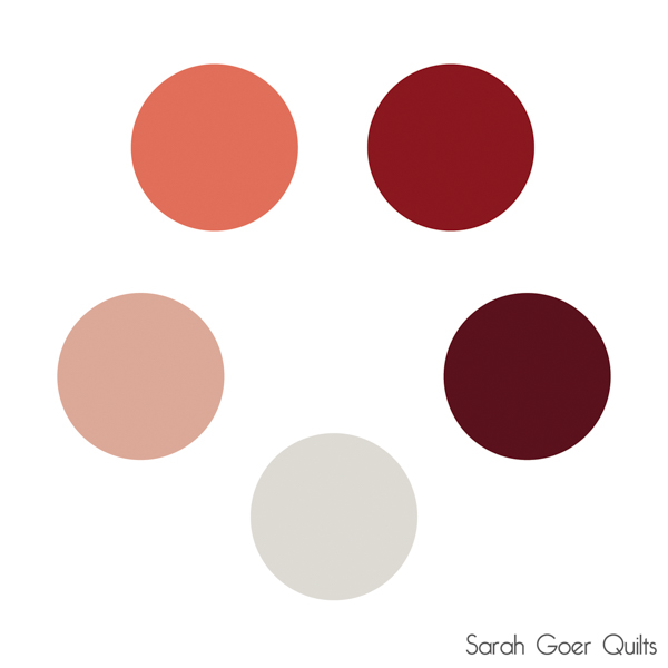
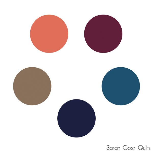
One of my favorite parts of my newsletter is building color palettes. I thought I'd share a couple of them here with you! My inspiration for this week's palettes is the 2019 Pantone Color of the Year: Living Coral. I think it's not quite pink enough, but I used Kona Nectarine as the closest Kona Cotton to Living Coral. (Anyone think a different Kona is closer? Or another solid brand has a closer match?)

Kona Cotton colors are listed clockwise from upper left. Always check actual bolts/samples before making your purchases, as colors display differently on different screens.


Nectarine, Red, Ruby, Bone, Peach.
 

Nectarine, Cerise, Caribbean, Nightfall, Taupe.
 

Every other newsletter includes four palettes. I actually created five this week, so there are three more Living Coral inspired palettes in my latest newsletter. Not a subscriber yet? Subscribe here. (Be sure to check your email to verify your subscription.)

What color would you pair with Living Coral?

6 Comments

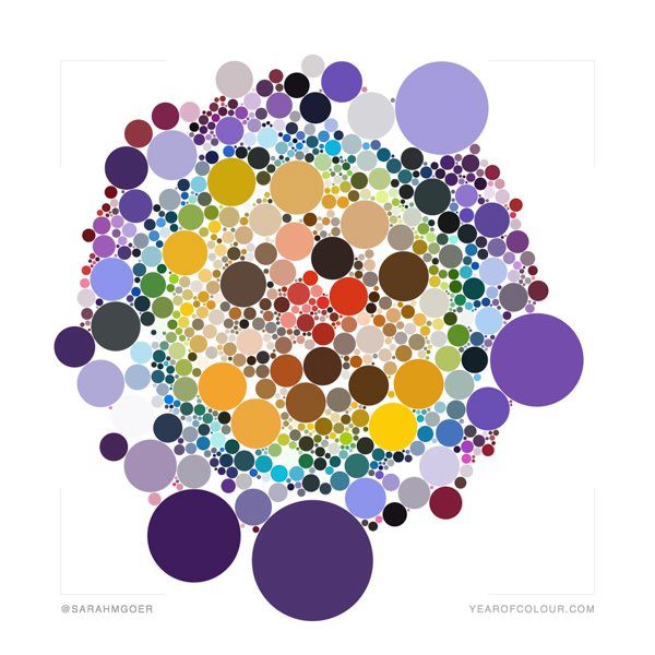
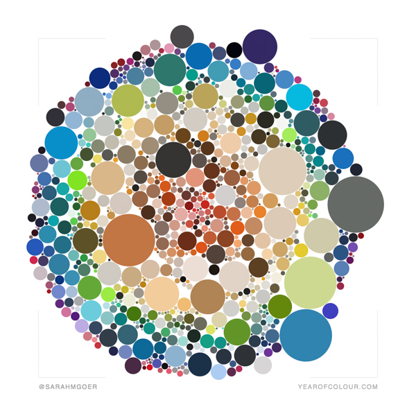
Yesterday I shared my Top Nine from Instagram. Another fun IG activity this time of year is Year of Colour. It's a web app for creating a graphic representation of the colors using throughout all IG posts in 2018. You can also get a report of the last month, last year, or custom period of your choice.

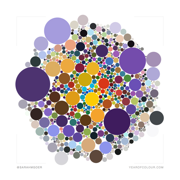
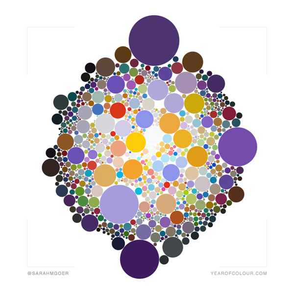
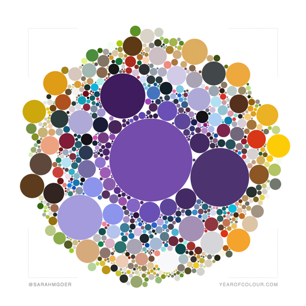
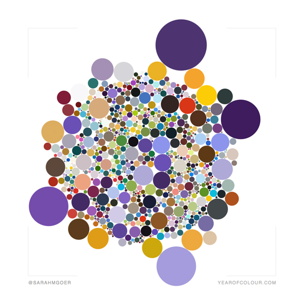
Once the initial report is generated, you can change the settings on the data to emphasize saturated colors, emphasize brighter colors, reload with a color of your choice in the center, order colors by time, rainbow mode, or play through which is a slide show mode. There are also two sliders in the settings which filter by significance and vibrancy of the colors. The report is described on the website as: "Each circle represents one of ten significant colours we've extracted from each image they posted in a year. The size of the circles indicates two things - how significant the colour was in the image, and how well liked it was by their followers."

Bottom line, this app is a color-lover's dream! I used many Year of Colour graphics from others as inspiration for color palettes in my newsletter. (Not a subscriber? Signup here.)

And now for the color! I set my sliders to about 80% on significance (the farther to the right on the first slider, the more circles show) and to most saturated color (left end of the slider) for vibrancy. Captions on each of the following five images show what mode created the image.

Emphasize Saturated Colors Mode
Emphasize Brighter Colors Mode
Center on Your Favorite Color Mode
Order Colors by Time Mode
Rainbow Mode

I particularly love the emphasize brighter colors and rainbow modes.

To compare 2018 above to 2017, the following image is the rainbow version of 2017. My favorite color was missing in my work last year!

Rainbow Mode 2017

You can view others' Year of Colour graphics at #yearofcolour and #yearofcolour2018.