What is Ombré? Mirriam-Webster says "having colors or tones that shade into each other."
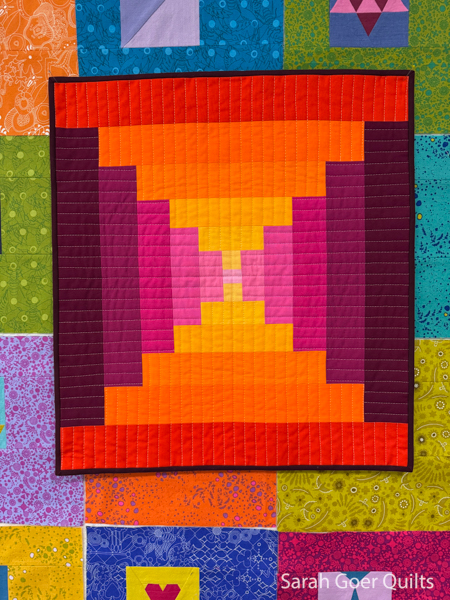
I love a color challenge and this one could be implemented two ways (or maybe more!?). We could use ombré fabric in our design or we could build a palette that was an ombre of color. Somehow we had to include an ombré or a gradient. I chose to build two ombre palettes in pinks and oranges and work them together into a quilt.
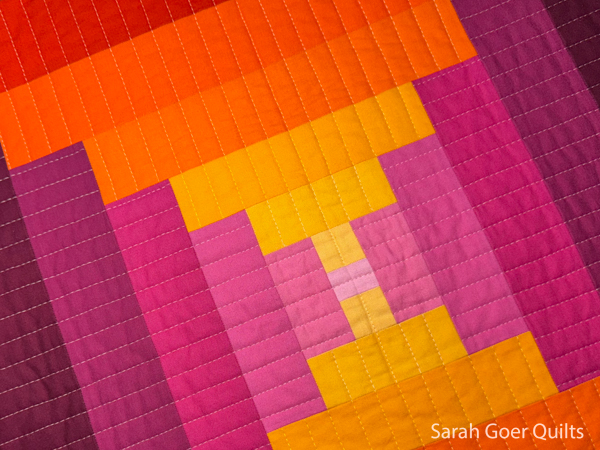
Pinks: Kona Bourdeaux, Cerise, Bright Pink*, Dragon Fruit*, Sassy Pink*, and Carnation.
Oranges/Yellows: Kona Flame, Torch, Clementine, Goldfish, Cheddar, and what I'm calling "Not Cheddar" but I have no idea what it actually is. (It was labeled Cheddar, but it clearly isn't.)
*these weren't marked, so I did my best to map them to the Kona color card for identification.
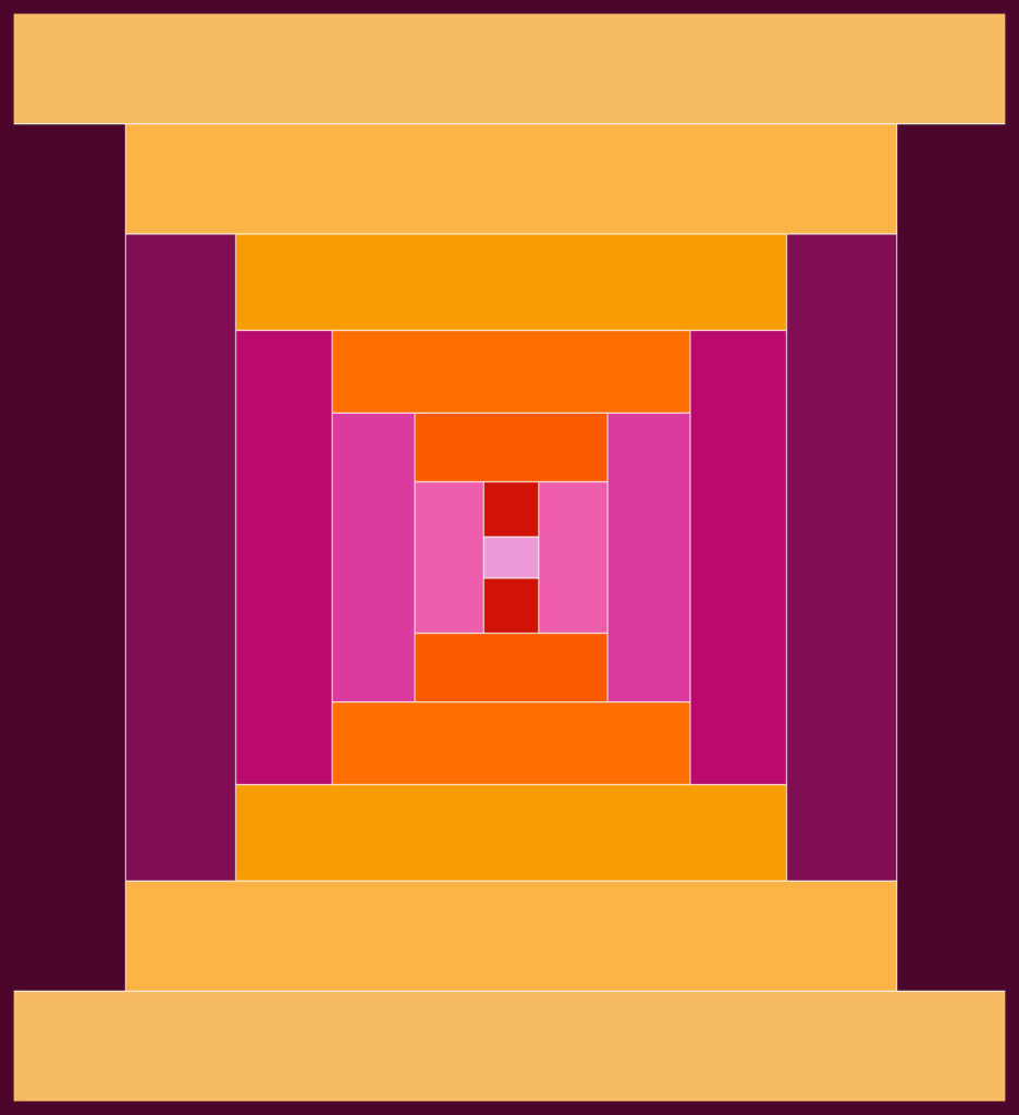
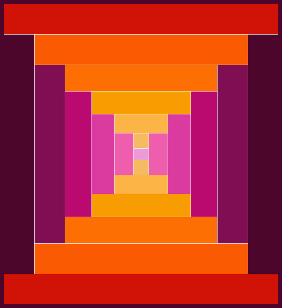
I created a mockup in Adobe Indesign to audition the color placement and make sure I liked my two gradients together. (Thanks to Ellyn for the idea to use Courthouse steps as my design inspiration.)
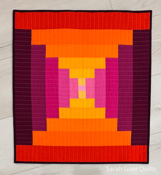
I quilted with walking foot quilting in two colors, Aurifil 50wt Baby Pink (#2423) and Light Lemon (#2110). It's bound in Kona Burgundy and finished at 19" x 21".
Thanks for visiting! I'm linking up on Kim's blog for the Project QUILTING Ombré challenge. Congratulations to everyone else who participated in the challenge this week. Next challenge drops on February 2nd.





Danice G
Gorgeous quilt. It is so colorful too.
sarah
Post authorThank you, Danice! Not my usual palette at all, but I love it. Thanks for visiting.
Ellyn
I love how this turned out!
sarah
Post authorThank you, Ellyn. I'm really happy with how it turned out.
Anja @ Anja Quilts
Great finish! I first heard about PQ from you, and it's been a fun adventure. ☺
sarah
Post authorAww. Glad to have introduced you to PQ!
Sally
It's so vibrant. Very pretty.
sarah
Post authorThank you, Sally!