On Tuesday I shared my Top Nine from Instagram. Another fun IG activity this time of year is Year of Colour. It's a web app for creating a graphic representation of the colors using throughout all IG posts in 2019. You can also get a report of the last month, last year, or custom period of your choice. The controls have changed this year, but there are a variety of options, including organizing your year by date, hue, size, and brightness. You can also remove your dullest and/or darkest colors. Here are a few views of my year on IG, starting with the default view.  Then I changed to show more colors, focus on vibrancy, and to group colors into smaller sections (for more circles).
  Size (largest in center)
  Size (smallest in center)
  Hue
Hue  Hue (alternate) I feel like I have the most balanced rainbow this year compared to previous years, though orange is clearly the underutilized color in my work. To compare this year's "hue" view to rainbow mode from 2018 and 2017, I've included the two following images.
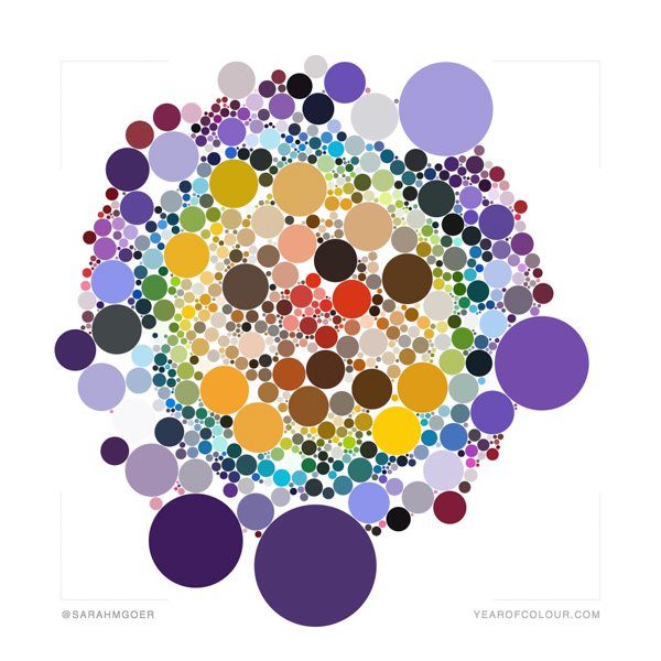
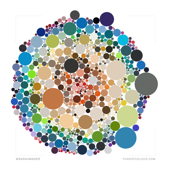
You can view others' Year of Colour graphics at #yearofcolour and #yearofcolour2019.
I'm participating in the 31 Day Blog Writing Challenge with Cheryl of muppin.com.


Kathleen Scargle McCormick
I love the dimensionality in the size version.
sarah
Post authorIsn't it great!? Thanks for visiting, Kathleen!