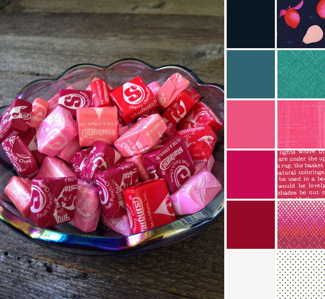
Welcome to Color Play Friday. I missed last week when they featured a building in Minneapolis. This week we have this photo of a lovely bowl of Starburst candy. At first glance the photo reads as really PINK, which isn't exactly my favorite color to work with. Taking a closer look, there's actually an amazing number of color options in the reflection on the edge of the bowl. In addition to the pinks and reds from the candy, my initial color palette included a variety of blues and jewel tones in purples, blues, golds, and greens. I also had some grey in there as well.
As I worked through fabric selection I narrowed my palette. The first fabric I locked on was the Fruit Stand. I loved it for the colors as well as the play on the fruit flavors of the Starburst. I wouldn't be surprised if others chose this fabric as well this week! It would have worked in either color way, but I liked that this one brought in the navy color from my palette. And I loved how the Tula Pink Mosaic pulled in all the Starburst colors and worked with the colors in Fruit Stand. From there I moved on to blenders.
It's hard to tell from the thumbnail, but some of the print in the Fruit Stand fabric is in polka dots, which is what drove me to add a polka dot fabric to my palette. And while the Ultra Marine Crosshatch is a little out there and didn't match my green swatch perfectly (trust me, I hunted to find a better matching green in the photo!), I really liked what it added to the overall palette. The Lecien modern text fabrics had a number of possible colors from my original, larger palette and I really wanted to work one in since I love text fabrics.
There are NINE of us participating this week. (Links below.) I can't wait to see what everyone else came up with.
I created my palette with Palette Builder 2.1 by Play Crafts.

Solids:
Kona Nautical
Kona Everglade
Kona Punch
Kona Pomegranate
Kona Rich Red
Kona Snow
Prints:
Fruit Stand in Navy by Melanie Miller, Cotton & Steel
Crosshatch in UltraMarine by Carolyn Friedlander, Robert Kaufman
Painter's Canvas in Lipstick by Laura Gunn, Michael Miller
Text in Pink by Lecien
Mosaic in Magenta by Tula Pink, FreeSpirit Fabric
Le Cr'eme Swiss Dot Navy by Riley Blake Designs
Check out the other palettes this week at:
- Laurel, Poppy & Pine - Lorinda
- In an Otter Life - Trina
- Quilting Mayhem - Mindy
- Shimmy and More - Stephanie
- Sew Not Perfect - Bethany
- Quilty Dream - Yvonne
- Crafting Chronicles - Christina
- 123 Quilt - Sarah
If you'd like to participate in Color Play Friday you can visit In An Otter Life or Laurel, Poppy and Pine for the rules, their contact information, and next week's photo. Additionally, this month there's an opportunity to purchase Lorinda's bundle or Trina's bundle (or both) at Stash Fabrics. And visit Lorinda and Trina's blogs for a chance to win their bundles!
Thanks for visiting. If you're new here, check out my last three posts, where I'm sharing about the classes I took at QuiltCon and giving away a bundle of my QuiltCon goodies. :-)


Johanna
This looks like a great way to break down a palette whether one is quilting or painting. Good choices; I like yours best.
sarah
Post authorThank you!
Lorinda Davis
Great bundle! I like that we have a fabric twin this week.
sarah
Post authorWe definitely picked a good one. Makes me want to own it in that color way. :-)
Yvonne Campbell
Your bundle is well worked out. Love the fruit stand.
sarah
Post authorThank you, Yvonne. I'm surprised nobody else chose it!
Sarah @ 123quilt
Your palette is gorgeous. It just screams sophistication to me.
sarah
Post authorAww... Thank you, Sarah.
Wendy Darbouze
Fun colors! I love the bright pinks.
sarah
Post authorThanks, Wendy!
Bethany
I also love that Fruit Stand Choice. The Tula print was in my bundle originally in another colorway, but ended up not making the cut. That would have been three of us (at least) using the same print! Another great palette, Sarah. I always love your choices.
sarah
Post authorThank you, Bethany. I love that Tula print. I cut some of it in the purple color way for my purple Royalty quilt (which has been sadly neglected in favor of more urgent sewing -- I should get back to that).
steph
What a fun palette! I'm glad you stuck with the fruit stand, love it. I like how all you bundle as a little pop of white. I reminded me of how the logo on the starburst are printed in white. so it seemed like you fabric choices repeated that, connecting them to the photo more. I like it.
sarah
Post authorThanks, Steph. I had a great time using the theme of the photo as well as the color palette!
Trina
The Tula Fabric is perfect for this palette!!!
sarah
Post authorThank you, Trina. I thought so too. :-)